13A Final Portfolio

Audience/Message: My audience is prospective employers looking to hire a visual designer. My message is to convince those employers that I would be an asset to their company and that my designs are unique.

Process: I started out not having any idea what kind of a backdrop to do. I wanted some continuity, but nothing too repetitive. I chose to go with lines that were overlapping using colors from the designs. I started by having the the lines overlapping and set then neatly lined up with the corner. I decided that that looked too boring and there was nothing fresh about it. So after some playing, I decided to group the four lines and then rotate them at different angles on each slide. It took the design that I really liked and pumped it up and made it feel more fresh and unique. I then saved the slides as jpegs, and then as pdfs to upload into a slideshare.

Critique Report: I critiqued Elizabeth McDonald’s, Seattle Benson’s, and Kelly Coppin’s slides.  Seattle critiqued mine and complimented my color scheme and the organization of my slides but didn’t give any suggestions for edits.

Font Name/Category: Title: Brush Script Std (script) and Adobe Fangsong Std R (serif). The slide texts are Brush Script Std (script) as well.

12B Magazine Spread Project Final

Message/Audience: I chose to do my magazine spread article about my own conversion story. I wrote it and realized that it could really go in either the New Era or the Ensign. The audience would be any young teenage or older LDS member. The message was to convey through my conversion story that not every conversion has a huge, emotional story behind it; sometimes a moment filled with peace is sufficient.Process: I thought drawing up four sketches would be overwhelming, but as I got to my last sketch, I really felt the creative juices start to flow. I can appreciate the process of multiple sketches and not getting discouraged or just settling with the first sketch. Again, the sketch map made it so much easier to just insert images into the layout. InDesign is a little less intuitive for me, so I struggled with it a bit more than PhotoShop, but I can see its benefits. I had to do multiple prints and even change some of the colors to get it to turn out how I wanted them to be when printed.I wanted to keep similar shape lines with the ovals, but I felt that the line in the wall behind the girl and the hard lines of the edges of the Book of Mormon allowed me to get away with the rectangle shape on the left and the square quote box with rounded edges. I think the quote box tied it all together.I chose teal, indigo, and gold colors. I used the eyedropper tool on the Book of Mormon to match the shade of the quote box.

Critique: I was critiqued by Sister Larson, Cristiano Trindade and Seattle Benson. They all suggested that I adjust the spacing in the quote box, and with Sister Larson’s help, I learned how to ignore the text wrap option. Sister Larson and Seattle both thought that the bar on the left may print out too dark and suggested that I lighten it or adjust the color. I did that as well. Sister Larson suggested that I work on my title. I played with the fonts and feel better about it. Since I changed to font of my title, I felt I needed to change the font of the quote box so that the complemented each other.

Font Name/Category: I used Vladimir Script (script) for the title. Perpetua (serif) for the byline and quote box, and Arial (san serif) for the copy.

Sources: Book of MormonGirl reading scripturesYoung Women Medallion

12A Final Magazine Spread Adobe InDesign Sketch Map for 12A Magazine Layout Project Layout Sketch for 12A magazine spread project

12A Magazine Spread Project Draft

Message/Audience: I chose to do my magazine spread article about my own conversion story. I wrote it and realized that it could really go in either the New Era or the Ensign. The audience would be any young teenage or older LDS member. The message was to convey through my conversion story that not every conversion has a huge, emotional story behind it; sometimes a moment filled with peace is sufficient.

Process: I thought drawing up four sketches would be overwhelming, but as I got to my last sketch, I really felt the creative juices start to flow. I can appreciate the process of multiple sketches and to not get discouraged or just settle with the first sketch. Again, the sketch map made it so much easier to just insert images into the layout. InDesign is a little less intuitive for me, so I struggled with it a bit more than PhotoShop, but I can see its benefits.

I wanted to keep similar shape lines with the ovals, but I felt that the line in the wall behind the girl and the hard lines of the edges of the Book of Mormon allowed me to get away with the rectangle shape on the left and the square quote box with rounded edges. I think the quote box tied it all together.

I chose a complementary blue/indigo and orange/gold color scheme. I used the eyedropper tool on the Book of Mormon to match the shades.

Font Name/Category: I used the Cambria (oldstyle) and AR Berkley (decorative) for the title. AR Berkley (decorative) for the quote box, and Arial (san serif) for the copy.

Sources: Book of MormonGirl reading scripturesYoung Women Medallion

12amagazinespread-leahbashamfinal


Layout Sketch for 12A magazine spread projectLayout Sketch for 12A magazine spread projectLayout Sketch for 12A magazine spread project

Layout Sketch for 12A magazine spread project

Adobe InDesign Sketch Map for 12A Magazine Layout Project


11A Web Page Layout Project

Peterson Properties Team mock web page layout. Pictures of Leah and Tasha on a Meet the Team page.

11A Shape Map done in PhotoShop for mock web page layout

11a sketch for Webpage layout


Message/Audience: My message for this particular page is to quickly introduce Tasha and myself as well as our position within the team. Our audiences are our clients as well as those who may be searching for a real estate agent.

Process: I chose the company that I work for to design a web page around. I started with the monochromatic color scheme that already had: red, black, and white. I wanted to keep my page as neat and clean as possible. I started with basic shapes in my outline and chose to put my logo front and center at the top. I put the possibly links up top that could be found on a real estate page. At the bottom, there would be clickable links to houses that have been sold by the team. I used a lot of layers! Especially clipping layers. Even after I had made my shape map, I still made changes as I was adding elements. It was a huge help to have that shape map, though! Thinking about sitting down at the compute and starting from nothing is overwhelming! My final project had a few differences with each transition from the sketch to the shape map and the shape map to the style guide.

Critique Report: I critiqued Zach Williams and Jolene Bullock. As of right now, no one has critiqued my project.

Font Name/Category: Both my header and body are Verdana (san serif). I wanted to keep things as uniform as possible.

10A Movie Poster Project

Message/Audience: My message is to entice others to come see the X-Files movie and realize that “the truth is out there”. 😉 It is appealing to Sci-fi fans and moviegoers alike.

Process: I chose the X-Files poster on the criterion that I could photoshop my hubby into the photo as well so that it wasn’t just me on the poster and because I was once told (either by a friend or a Facebook doppleganger quiz) that I look like Gillian Anderson. I also looked for people that had similar face shapes and features similar to my husband and myself. I took the photo of my husband and he took the photo of me. We studied the positioning of the eyes and angles of the heads, lighting, and camera. I had a heck of a time selecting the jaw line from the neck since the camera angle definitely shows a lot of neck. After selecting the faces and layering them on top of the X-Files poster, I had to adjust the vibrance, color balance, and levels to get the blueish haze. My biggest help was the blending tool to smooth out the edges of mine and my husband’s faces to blend into the poster. I appreciated the value of layer masks! I had fun searching for the specific fonts and playing with the font options – kerning and point size. I have done next to nothing with photoshop aside from this class’s projects, but I am pretty proud of what I did! 🙂

Critique Report: Jolene Bullock and Pollyanna Reyes critiqued my project. They both told me that my project looked professional and unfortunately had no suggestions.

I critiqued Erika Martinez and Pollyanna Reyes.

Font Name/Category: The body copy is SF Movie Poster (san serif), Title is Assiduous (san serif), and the large, black X is The X-Files (decorative slab serif)

Sources: Original X-Files Poster. Movie description based off of the description here.


X-files poster with Leah and Daniel's faces photoshopped in.


9A Photographic Study Project

Process: I chose to photograph my husband’s guitar that was given to him by his late father. This is the guitar that my husband learned to play on, so this guitar in particular (of the many guitars that he owns) has sentimental value. When I took the photos tried to be mindful of the time of day as well as the angles. As I edited them, I played with hues, saturation, and the curve. The curve was very helpful! My guaranteed go to was adjusting the levels of the photos so that the arrow were at the beginning of the peaks.

Here is my collage featuring 5 of my favorites from the collection followed by the other 7 photos. Below that is my blended photo followed by the original photo, texture photo, text photo source, and Critique Report.

Collage of pictures of guitar from different angles.

Side view of guitar leaning against a tree

Guitar leaning against tree

View of guitar lying on its side on the ground from the neck down.
Guitar in hallway. Birds eye view

Close up of right side of a guitar head

Close up of guitar fret bord

Worms eye view of guitar

Blended Photo and originals:

20161109_174318

wildtextures-creased-gilded-decorative-paper-texture

9a-blended-image-blog

source: Texture photo

Critique Report: I critiqued Megan Rempel and Jesus Arrendondo. Megan critiqued my project and suggest that I make my title shorter. While I understand her suggestion, the title has a bit of an inside meaning between my husband and myself so I chose to keep it.

8C LFC Photography Activity

I am a lover of natural things and cringe when I need to edit things. I think originality is beautiful, so in light of that, I did minimal editing. I mostly just cropped and straightened images. I tried my best to get the elements needed in my shot so there wouldn’t be a need for much editing.

I struggled with my outdoor lighting photo a bit as I felt it took me a while to get a decent light and background, but I love the juxtaposition of the glitzy shoes against the background of the rough and slightly dirty wall.  The lighting for the indoor photo was difficult as well because of poor lighting in the house, but I love the look of the natural light pouring in! The focus of the foreground and background was fun. I love the color contrast as well. The picture of my daughter is my photo using rule of thirds/strong lines. The lines in the brick along with the lines on the house create strong lines while the positioning of my daughter is placed in he photo using the rule of thirds. The lead room photo is of a wooden elephant my grandmother brought over from Thailand. I have always adored this statue and thought it would make a great subject for this particular photo.

Outdoor Light

Outdoor Light

Inside Light

Inside Light

Foreground

Foreground


8c-background

Background

8c-strong-lines

Rule of Thirds


8c-lead-in

Lead Room


8A Social Media Marketing Project

My entity is actually the company I work for. I am a closing coordinator for a Keller Williams real estate team based in NY. I am relatively new to the team so I thought it would be a great way to put a face to a name for many of the clients I will only ever have contact with via phone or email. The goal is to get more personal as well as to get the face of the company back into the social media world. We want to be more interactive with our clients outside of contracts and deadlines.

I tried to solicit interaction by asking viewers to respond to a question at the end of the video. I also asked them to share, like, and follow us.

Company: Peterson Properties Team with Keller Williams in Mohawk Valley

Objective: Loyalty and Retention/Recognition

Strategy: Introduce myself as the new closing coordinator and explain what I do via a YouTube video. I will share this on our company Facebook page. I asked a question at the end to solicit feedback and hopefully get some interaction going between us and our clients past and present.


Critique: I critiqued Todd Edwards’ and Seattle Benson’s projects.


7A Sketches and Pictures

I chose to write to the Ensign about my conversion story and how I came to know the Book of Mormon was true. My target audience is anyone that may be struggling with know the church is true. While I think that those similar to my age and circumstances during my experience may relate better, I fell all ages may be able to relate.
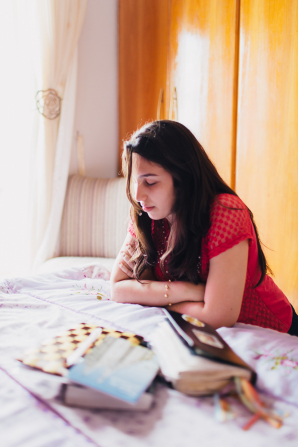
 

My Story

How do I know if the church is true? How do I find out? It was a question that I would never have to ask myself. I have never been the rebellious type. That was some of my brothers. I, on the other hand, loved primary as a child. I knew the words to all the primary songs and sang loud and proud. I knew all the primary answers. I said my prayers and enjoyed Family Home Evening … even when many of my siblings were being rowdy. When I finally reached the age to go into the Young Women program I was nervous of course, but I was excited. I was beyond anxious to get my personal progress book and jumped in feet first to earn my Young Women medallion. In class, I volunteered to read quotes and scriptures. My hand was often the first one to shoot up when a question was asked. I loved my Young Women’s leaders. I was in no way perfect, but in general, I had no problem obeying the rules and keeping the commandments.

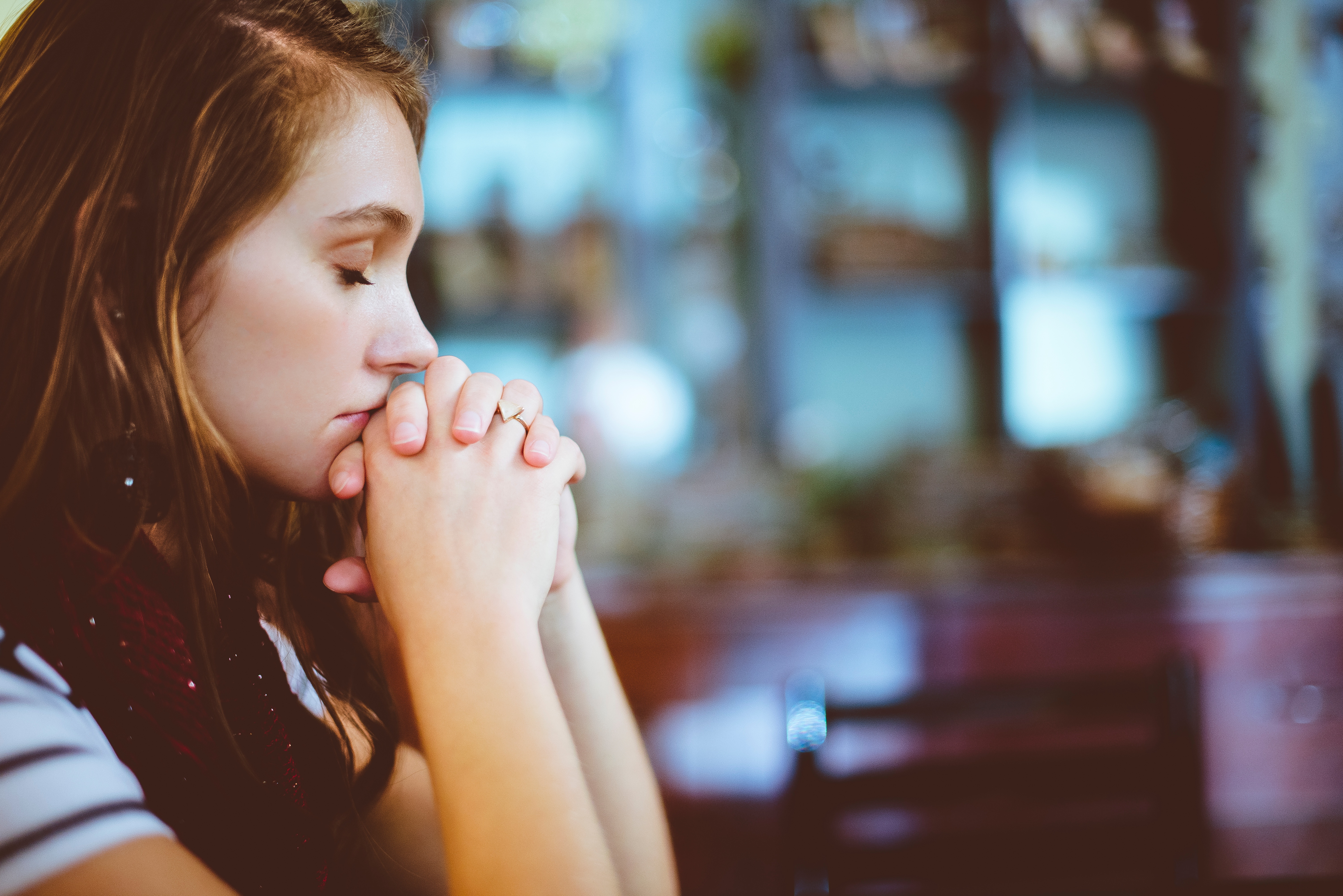
Despite all of this enthusiasm, there was something that bothered me ever so slightly in the back of my mind. I knew all the right answers at church, but did I know that the church was true? Did I really have a testimony of the Book of Mormon? I knew that having a testimony of the truthfulness of the Book of Mormon was more than just knowing the right answers; there was definitely a difference between the two. I had to find out if I had a testimony or if I just knew the right answers.

I was a freshman in college at Brigham Young University – Idaho, and it was time to decide if I had a real testimony or not. I accepted that gaining a testimony wasn’t something that anyone could do for me. I began by reading the Book of Mormon from start to finish; something I had never done by myself. My initial goal was to read the Book of Mormon all the way through simply so that I could say I had done it.  Every night before I read, I prayed for understanding. I asked Heavenly Father to help me to understand the testimonies compiled in the Book of Mormon.

I had heard many people’s testimonies shared over the pulpit that described beautiful moments and life-changing, tear-inducing experiences that confirmed to the speaker that the Book of Mormon was true. After months of reading the scriptures, I still had nothing even close to that. I didn’t have a moment where I heard a voice speak to me and tell me the Book of Mormon was true. I didn’t have a dream of an ancestor visiting me telling me to read the book. I was born into the church, so I didn’t even have a story about two missionaries knocking on my door and introducing me to the Book of Mormon. What was a testimony without a tear-jerking story to go with it?

As I continued to read and pray, I became discouraged. Then one night, a second thought that had been swirling around in my mind off and on for months stuck with me. I remembered my former Young Women’s president getting up and bearing her testimony. She said that she had prayed for a long time to know if the church was true. When she received her answer she came to the realization that she had known all along. Had I known all along too? I got down on my knees and prayed. After days of praying and asking if I had known all along, I received my answer.

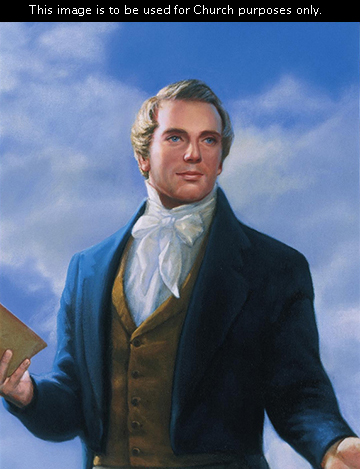
It didn’t bring me to tears, and choirs of angels didn’t sing to me in my dreams, but I felt peace. I felt joy. I had known all along. I knew the Book of Mormon was true. I knew that Joseph Smith was a prophet. I didn’t need big allegorical flashes of light or emotional moments that reduced me to my knees. I felt the Holy Ghost bring light into my soul and peace into my heart. That’s it. Just peace.

From this, I’ve learned that not everyone gets those big “aha” moments, and that’s okay. Sometimes a whisper will do. I know what I know, and I don’t ever want to forget it.


Sketches and images


photo-1475938476802-32a7e851dad1

nauvoo-temple-joseph-art-lds-82988-gallery-notice20161026_224046brazil-young-women-praying-prayer-1411735-gallery

6A Slide Design

I chose the talk “Look to the Book, Look to the Lord” by Elder Gary E. Stevenson. This talk was given this past October General Conference (Saturday afternoon session, Oct. 1, 2016).

Speaker’s Outline:

“Look to the Book, Look to the Lord”

  • October 1, 2016 Saturday afternoon session General Conference

Mary Elizabeth Rollins

  • Met missionaries, asked Brother Whitmer to borrow Book of Mormon
  • Read a lot of the book overnight
  • Joseph Smith gifted her a Book of Mormon

Keystone

  • Book of Mormon is the keystone of your testimony
  • Keystone is most important stone in the arch

My Witness

  • My experience
  • Met Japanese grandmother
  • Bore my testimony in Japanese, she was touched

Your Witness

  • Each of you can receive your own witness
  • Book of Mormon was written for you day, for you
  • Moroni’s vision

Challenge

  • Put away electronics, open the scriptures
  • Seven hours a day on electronics

Promise

  • Moroni’s promise
  • Christ is referenced approximately every 1.7 verses

With a sincere heart and real intent

  • Moroni’s promise
  • Scriptures will strengthen your faith, fill your soul with light, and prepare you for the future

Message/Audience: The message of my slide was to encourage the audience to gain a testimony of the Book of Mormon. The audience was those in attendance and watching General Conference. from all over the world, I chose a complementary color scheme using gold and indigo. The font is in Candara (sans serif). I struggled with this a bit feeling that my slides were very plain, but I found that even something as simple as a shadow could make an element pop. I didn’t want a lot of white, so I chose a bold indigo color to fall as the backdrop and act as whitespace for the slides. My slides are obviously not close to my sketches. I really appreciated the talk I chose. It has strengthened my testimony.

Critique: I critiqued Pollyanna Reyes’ and Erika Martinez’s blogs.

Here are my sketches.
6A Slide Design sketches
Image Sources:

Woman kneeling to pray

Girl reading by the fireplace

iPad with Gospel Library App open

Elder Gary E. Stevenson

Arch with Keystone

Highlighted scripture

Book of Mormon and Gold Plates

Moroni burying the Gold Plates