13A Final Portfolio

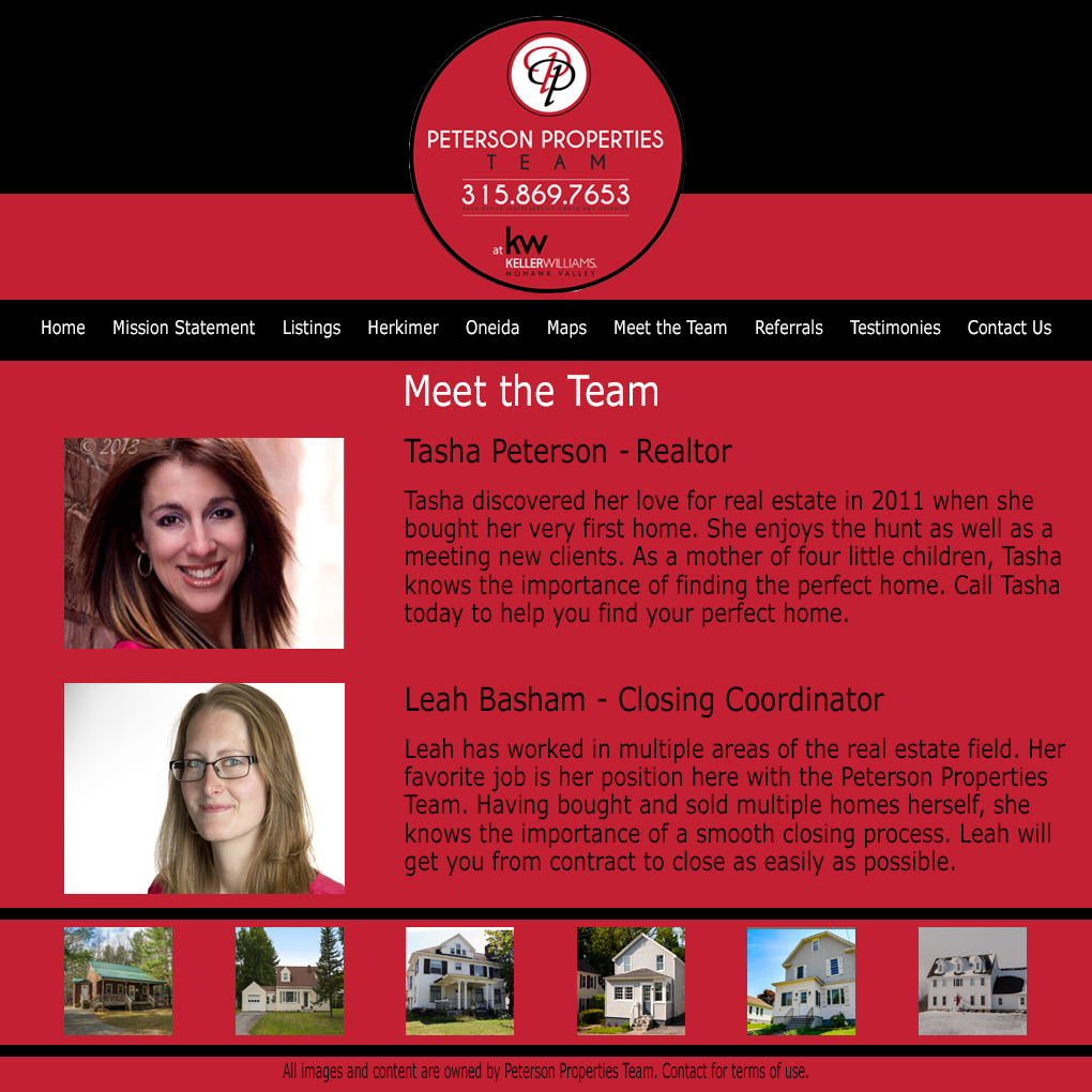
Audience/Message: My audience is prospective employers looking to hire a visual designer. My message is to convince those employers that I would be an asset to their company and that my designs are unique.

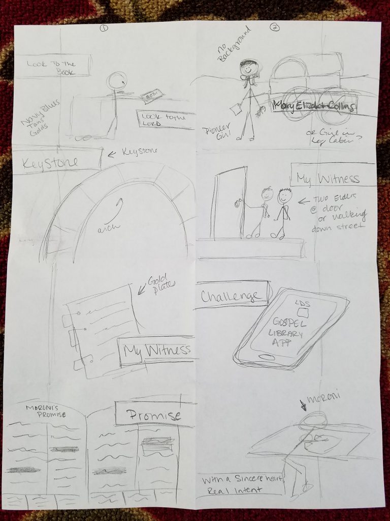
Process: I started out not having any idea what kind of a backdrop to do. I wanted some continuity, but nothing too repetitive. I chose to go with lines that were overlapping using colors from the designs. I started by having the the lines overlapping and set then neatly lined up with the corner. I decided that that looked too boring and there was nothing fresh about it. So after some playing, I decided to group the four lines and then rotate them at different angles on each slide. It took the design that I really liked and pumped it up and made it feel more fresh and unique. I then saved the slides as jpegs, and then as pdfs to upload into a slideshare.

Critique Report: I critiqued Elizabeth McDonald’s, Seattle Benson’s, and Kelly Coppin’s slides.  Seattle critiqued mine and complimented my color scheme and the organization of my slides but didn’t give any suggestions for edits.

Font Name/Category: Title: Brush Script Std (script) and Adobe Fangsong Std R (serif). The slide texts are Brush Script Std (script) as well.

12A Magazine Spread Project Draft

Message/Audience: I chose to do my magazine spread article about my own conversion story. I wrote it and realized that it could really go in either the New Era or the Ensign. The audience would be any young teenage or older LDS member. The message was to convey through my conversion story that not every conversion has a huge, emotional story behind it; sometimes a moment filled with peace is sufficient.

Process: I thought drawing up four sketches would be overwhelming, but as I got to my last sketch, I really felt the creative juices start to flow. I can appreciate the process of multiple sketches and to not get discouraged or just settle with the first sketch. Again, the sketch map made it so much easier to just insert images into the layout. InDesign is a little less intuitive for me, so I struggled with it a bit more than PhotoShop, but I can see its benefits.

I wanted to keep similar shape lines with the ovals, but I felt that the line in the wall behind the girl and the hard lines of the edges of the Book of Mormon allowed me to get away with the rectangle shape on the left and the square quote box with rounded edges. I think the quote box tied it all together.

I chose a complementary blue/indigo and orange/gold color scheme. I used the eyedropper tool on the Book of Mormon to match the shades.

Font Name/Category: I used the Cambria (oldstyle) and AR Berkley (decorative) for the title. AR Berkley (decorative) for the quote box, and Arial (san serif) for the copy.

Sources: Book of MormonGirl reading scripturesYoung Women Medallion

12amagazinespread-leahbashamfinal


Layout Sketch for 12A magazine spread projectLayout Sketch for 12A magazine spread projectLayout Sketch for 12A magazine spread project

Layout Sketch for 12A magazine spread project

Adobe InDesign Sketch Map for 12A Magazine Layout Project


11A Web Page Layout Project

Peterson Properties Team mock web page layout. Pictures of Leah and Tasha on a Meet the Team page.

11A Shape Map done in PhotoShop for mock web page layout

11a sketch for Webpage layout


Message/Audience: My message for this particular page is to quickly introduce Tasha and myself as well as our position within the team. Our audiences are our clients as well as those who may be searching for a real estate agent.

Process: I chose the company that I work for to design a web page around. I started with the monochromatic color scheme that already had: red, black, and white. I wanted to keep my page as neat and clean as possible. I started with basic shapes in my outline and chose to put my logo front and center at the top. I put the possibly links up top that could be found on a real estate page. At the bottom, there would be clickable links to houses that have been sold by the team. I used a lot of layers! Especially clipping layers. Even after I had made my shape map, I still made changes as I was adding elements. It was a huge help to have that shape map, though! Thinking about sitting down at the compute and starting from nothing is overwhelming! My final project had a few differences with each transition from the sketch to the shape map and the shape map to the style guide.

Critique Report: I critiqued Zach Williams and Jolene Bullock. As of right now, no one has critiqued my project.

Font Name/Category: Both my header and body are Verdana (san serif). I wanted to keep things as uniform as possible.

10A Movie Poster Project

Message/Audience: My message is to entice others to come see the X-Files movie and realize that “the truth is out there”. 😉 It is appealing to Sci-fi fans and moviegoers alike.

Process: I chose the X-Files poster on the criterion that I could photoshop my hubby into the photo as well so that it wasn’t just me on the poster and because I was once told (either by a friend or a Facebook doppleganger quiz) that I look like Gillian Anderson. I also looked for people that had similar face shapes and features similar to my husband and myself. I took the photo of my husband and he took the photo of me. We studied the positioning of the eyes and angles of the heads, lighting, and camera. I had a heck of a time selecting the jaw line from the neck since the camera angle definitely shows a lot of neck. After selecting the faces and layering them on top of the X-Files poster, I had to adjust the vibrance, color balance, and levels to get the blueish haze. My biggest help was the blending tool to smooth out the edges of mine and my husband’s faces to blend into the poster. I appreciated the value of layer masks! I had fun searching for the specific fonts and playing with the font options – kerning and point size. I have done next to nothing with photoshop aside from this class’s projects, but I am pretty proud of what I did! 🙂

Critique Report: Jolene Bullock and Pollyanna Reyes critiqued my project. They both told me that my project looked professional and unfortunately had no suggestions.

I critiqued Erika Martinez and Pollyanna Reyes.

Font Name/Category: The body copy is SF Movie Poster (san serif), Title is Assiduous (san serif), and the large, black X is The X-Files (decorative slab serif)

Sources: Original X-Files Poster. Movie description based off of the description here.


X-files poster with Leah and Daniel's faces photoshopped in.


9A Photographic Study Project

Process: I chose to photograph my husband’s guitar that was given to him by his late father. This is the guitar that my husband learned to play on, so this guitar in particular (of the many guitars that he owns) has sentimental value. When I took the photos tried to be mindful of the time of day as well as the angles. As I edited them, I played with hues, saturation, and the curve. The curve was very helpful! My guaranteed go to was adjusting the levels of the photos so that the arrow were at the beginning of the peaks.

Here is my collage featuring 5 of my favorites from the collection followed by the other 7 photos. Below that is my blended photo followed by the original photo, texture photo, text photo source, and Critique Report.

Collage of pictures of guitar from different angles.

Side view of guitar leaning against a tree

Guitar leaning against tree

View of guitar lying on its side on the ground from the neck down.
Guitar in hallway. Birds eye view

Close up of right side of a guitar head

Close up of guitar fret bord

Worms eye view of guitar

Blended Photo and originals:

20161109_174318

wildtextures-creased-gilded-decorative-paper-texture

9a-blended-image-blog

source: Texture photo

Critique Report: I critiqued Megan Rempel and Jesus Arrendondo. Megan critiqued my project and suggest that I make my title shorter. While I understand her suggestion, the title has a bit of an inside meaning between my husband and myself so I chose to keep it.

8A Social Media Marketing Project

My entity is actually the company I work for. I am a closing coordinator for a Keller Williams real estate team based in NY. I am relatively new to the team so I thought it would be a great way to put a face to a name for many of the clients I will only ever have contact with via phone or email. The goal is to get more personal as well as to get the face of the company back into the social media world. We want to be more interactive with our clients outside of contracts and deadlines.

I tried to solicit interaction by asking viewers to respond to a question at the end of the video. I also asked them to share, like, and follow us.

Company: Peterson Properties Team with Keller Williams in Mohawk Valley

Objective: Loyalty and Retention/Recognition

Strategy: Introduce myself as the new closing coordinator and explain what I do via a YouTube video. I will share this on our company Facebook page. I asked a question at the end to solicit feedback and hopefully get some interaction going between us and our clients past and present.


Critique: I critiqued Todd Edwards’ and Seattle Benson’s projects.


6A Slide Design

I chose the talk “Look to the Book, Look to the Lord” by Elder Gary E. Stevenson. This talk was given this past October General Conference (Saturday afternoon session, Oct. 1, 2016).

Speaker’s Outline:

“Look to the Book, Look to the Lord”

  • October 1, 2016 Saturday afternoon session General Conference

Mary Elizabeth Rollins

  • Met missionaries, asked Brother Whitmer to borrow Book of Mormon
  • Read a lot of the book overnight
  • Joseph Smith gifted her a Book of Mormon

Keystone

  • Book of Mormon is the keystone of your testimony
  • Keystone is most important stone in the arch

My Witness

  • My experience
  • Met Japanese grandmother
  • Bore my testimony in Japanese, she was touched

Your Witness

  • Each of you can receive your own witness
  • Book of Mormon was written for you day, for you
  • Moroni’s vision

Challenge

  • Put away electronics, open the scriptures
  • Seven hours a day on electronics

Promise

  • Moroni’s promise
  • Christ is referenced approximately every 1.7 verses

With a sincere heart and real intent

  • Moroni’s promise
  • Scriptures will strengthen your faith, fill your soul with light, and prepare you for the future

Message/Audience: The message of my slide was to encourage the audience to gain a testimony of the Book of Mormon. The audience was those in attendance and watching General Conference. from all over the world, I chose a complementary color scheme using gold and indigo. The font is in Candara (sans serif). I struggled with this a bit feeling that my slides were very plain, but I found that even something as simple as a shadow could make an element pop. I didn’t want a lot of white, so I chose a bold indigo color to fall as the backdrop and act as whitespace for the slides. My slides are obviously not close to my sketches. I really appreciated the talk I chose. It has strengthened my testimony.

Critique: I critiqued Pollyanna Reyes’ and Erika Martinez’s blogs.

Here are my sketches.
6A Slide Design sketches
Image Sources:

Woman kneeling to pray

Girl reading by the fireplace

iPad with Gospel Library App open

Elder Gary E. Stevenson

Arch with Keystone

Highlighted scripture

Book of Mormon and Gold Plates

Moroni burying the Gold Plates


5A: Event Flier Project

Can I just say that I now know why designers charge so much for their services!! I have gone through so many different drafts with this project. I have been frustrated with this project, but I have still enjoyed the process! I know as I do more of this kind of work, it will come quicker to me.

Message/Audience: My audience is both hearing and deaf members of my community.  My message is an invitation to come and experience storytelling in ASL. The audience would also be able to learn a few signs.

Process: Like I mentioned above, I have so many drafts and revisions put into this project. The initial project that I submitted to be critiqued is so -almost embarrassingly- plain compared to my final draft. I have played with color schemes and sizing of the picture. I have aligned and realigned text! I have played with borders! This has truly shown me the work that goes into a design project!

My color scheme is a tetradic scheme using lime, violet, indigo, and gold. Photo sources at the very bottom.

Critique Report: I submitted two versions of my project on Facebook. Jesus Arredondo, Todd Edwards, and Christiano Trinidado critiqued my projects. Their suggestions included minimizing  the amount of text since it seemed busy and leaving the photo bleeding off both sides of the page. I completely agreed that there were just too many words. I changed my color scheme completely and even my pictures (I realized that I only had one picture instead of the required two).

I critiqued Zach Williams and Seattle Benson.

Font Name/Category: Title & Heading – Broadway (Decorative/Modern), Body copy – Ariel (sans serif).

Community ASL Event Flier Project 5A Two hands touching to form a heart shape in front of a row of books. Titled Read With Hands.


This is my screenshot from Word. There are SO many layers to this project!

Screenshot of Project in Word. Community ASL Event Flier Project 5A Two hands touching to form a heart shape in front of a row of books. Titled Read With Hands.


photo sources: Heart HandsPurple ASL symbolBooks

4A: Tasteful Typography

Message/Audience: I really enjoyed this assignment. I love working in Word, and being able to enhance an already beautiful image with equally appealing text is inspiring! I suppose I was inspired by conference coming up. I think my audience was really myself and my message was simply a reminder to myself to endure my trials to the end because it will all be for my good. And if Joseph can endure what he endured, I can surely endure my own trials.

Process: I did a lot a lot of playing around with the size of the rectangle behind the quote bleeding off the page as well as the size of the text box with the quote in it to get it to balance just right and follow the guidelines of the margins and such for quotes. I chose to let the scroll of the F in “Faith” hang off in attempt to pull the eye toward the text a little.

Critique Report: Sister Larson gave me a much appreciated critique and suggested that I change the color of the text. I originally chose a light grey color, but she felt it was rather monochromatic. I can’t say I disagreed. She suggested that I use one of the beautiful gold tones found in the picture, but when I tried those colors, it felt as if the text had a light shining on it in a direction opposite of the direction of the light shining on the prophet’s face. It felt distracting. So, I chose to use a shade of green from Joseph Smith’s pants. I think it appropriately draws attention to the quote without distracting or competing. Sister Larson also mentioned that the scroll of the F was hanging off and part of the F was touching the edge of the rectangle behind the text, but understood that it was an artistic choice and conscious decision to do so.

I critiqued Leslie Peterson Guthrie and Pollyanna Reyes.

Font Name/Category: Title – Kunstler Script (script), Body – Times New Roman (serif)

Photo Source: https://josephsmith.net/bc/content/images/joseph-smith-net/Artwork/swindle-liberty-jail.jpg

Joseph Smith kneeling in Liberty Jail looking heavenward. D&C 122:7 quotation to the right of him.


Here is my project in Word.


Screenshot of 4A Typography assignment in Word

2B: Gestalt Project

This is my 2B Gestalt project. I chose the ASL I Love You hand to start off what I hope to be my theme for the semester. Although I am still learning, I have a love and passion for ASL!

My design concept is my love for ASL. This is my first “art” class of any kind. Ever. So, I was grateful to be able to bounce ideas and concepts off of my son who is VERY artistic and has taken many art classes.

My basic, repeating shapes are the wavy lines.  They repeat  to make the shape of an ASL I Love You hand. I wanted to use white space in my design as well as make sure that the heart stood out. I thought about the color of the heart as well as making it solid and overlap the teal, wavy lines in order to make it contrast and stand out from the teal. I tried several different shades of pink and purple, but decided that the mauve that came in the same multicolor-pack of paper from Michael’s as the teal paper was the best option. (Good job, Michael’s, for knowing how to create great color combos! 😉 ) The other thing that I really considered was the size of the heart. Initially, I wanted to heart to be larger and upright and centered on the palm between the tips of the bent fingers and the bottom of the palm. I felt the size of that heart would have competed with or been visually equal to the size and width of the fingers. I feel that making the heart smaller and contrasting its size to the size of the overall hand made it pop even more.

With the help of my son and his explanation of diagramming, I aligned the edges of the heart with the directions of the lines of the first finger and the outside of the thumb and palm. It works out nicely that the angle in the “L” shape in the hand lines up with angle of the “dip” or “V” of the heart.

If I had to do this project over again, I would definitely plan for a broader border of white space around the hand. I would also play around with different sizes of the waves and the white space between the teal waves. I’m not sure how well this works with the white space being so broken up, but overall I am pleased with my design, especially considering this is my first real art project since elementary school. 🙂 I’d love feedback!

Teal Chevron ASL I Love You hand with mauve heart.